In short
Langmate is a geosocial networking “penpal” app made in Japan, designed to connect people globally with the same language interests, regardless of age, gender or origin.
Initially a user of the app, I was compelled by its potential and offered my design services to enhance its overall UI and user experience.
The primary goal to me was to revamp the app to improve accessibility and engagement, making it more appealing, and functional for both Japan local market and a more diverse and worldwide user base.
In short
Langmate(ラングメイト)は、日本製のジオソーシャルネットワーキング「ペンパル」アプリで、年齢、性別、出身地に関係なく、同じ言語の興味を持つ人々を世界中でつなげることを目指して設計されました。
最初はこのアプリのユーザーでしたが、その潜在能力に魅力を感じ、UIとユーザーエクスペリエンスを向上させるためにデザインサービスを提供することにしました。 私の主な目標は、アプリを改良してアクセシビリティとエンゲージメントを向上させ、日本のローカル市場とさらに多様で世界的なユーザーベースの両方に魅力的で機能的なものにすることでした。


Challenges
Throughout the project, the main challenge was designing an interface and experience that would cater to an incredibly broad audience. This involved understanding and integrating varied cultural nuances and behavior, while still maintaining the focus on its Japanese origin and unique social behaviors.
チャレンジ
プロジェクト全体を通じて、主な課題は非常に幅広いオーディエンスに対応するインターフェースとエクスペリエンスをデザインすることでした。これには、多様な文化的ニュアンスと行動を理解し統合すること、そして同時にその日本の起源とユニークな社会的行動に焦点を維持することが含まれていました。
Solutions
Approach: I initiated a comprehensive redesign of the app, starting with a new conceptual framework that redefined it as a “geosocial network app.” This included a thorough revamp of the UI to make it universally appealing, more inviting and less romantically inclined, focusing on user comfort and specifically targeting a broader, including female, audience.
Significant changes were made to make the app more inclusive and engaging:
ソリューション
アプローチ:アプリの包括的な再設計を開始し、それを「ジオソーシャルネットワークアプリ」として再定義する新しい概念的枠組みから始めました。これには、UIを徹底的に改良して普遍的な魅力を持たせ、より歓迎的でロマンチックな傾向を抑え、ユーザーの快適さに焦点を当て、特に女性を含む幅広いオーディエンスをターゲットにすることが含まれていました。
アプリをより包括的で魅力的にするために重要な変更が加えられました:

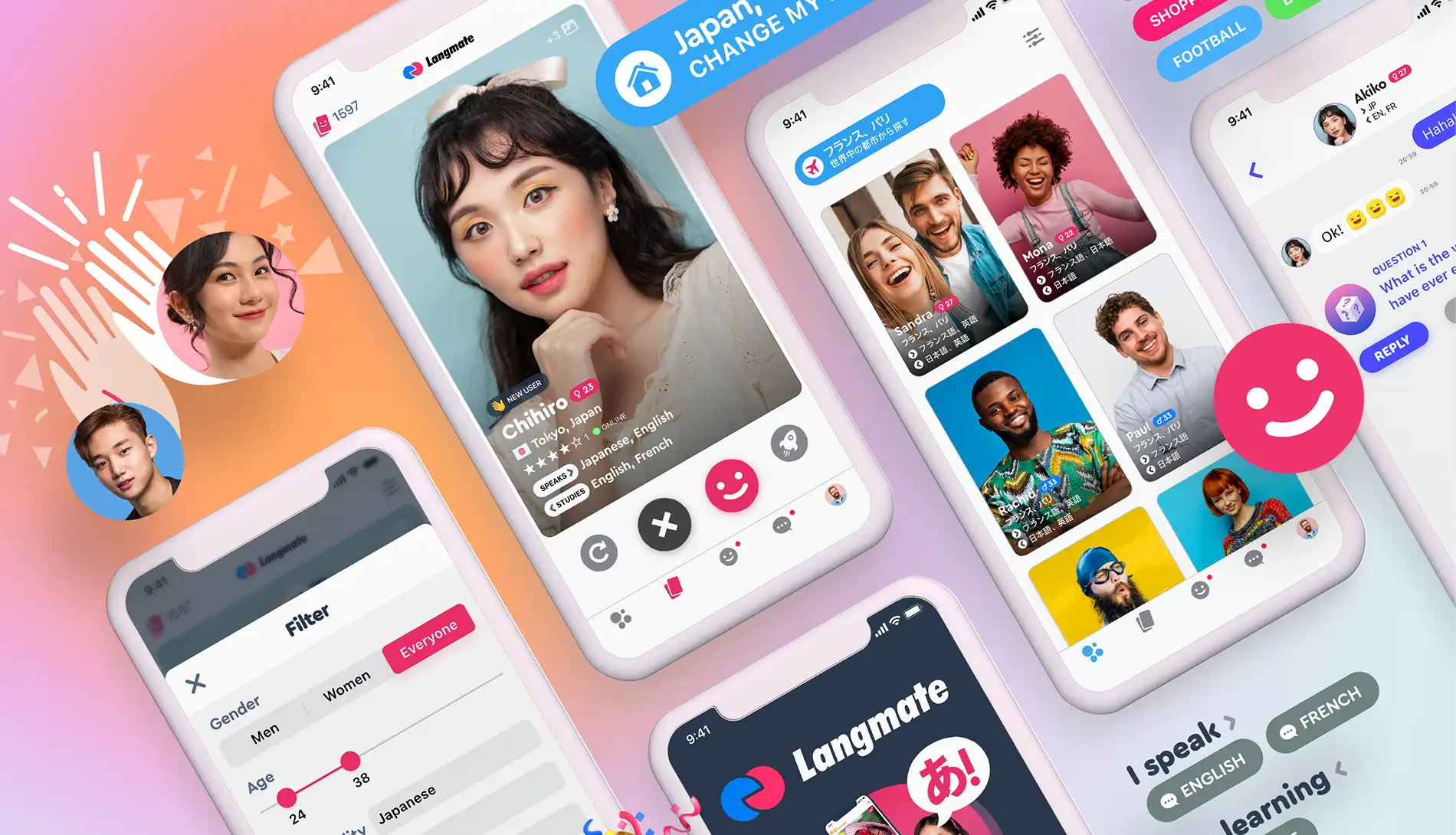
UI Elements
I transformed key visual elements to better resonate with a global audience. The heart icons, previously implying romantic connections, were replaced with smiley faces to promote a friendly, social interaction environment.
Terminology Adjustments
I revised the terminology used within the app to enhance user perception and remove any transactional feel. For example, the in-app currency previously known as “Coins” was renamed to “Smiles,” adding a playful, less commercial tone.
UIエレメント
私は、よりグローバルなオーディエンスに響くように主要なビジュアル要素を変更しました。以前はロマンチックな関連を示唆していたハートのアイコンを、フレンドリーで社交的なインタラクション環境を促進するスマイリーフェイスに置き換えました。
用語の調整
アプリ内の用語を見直し、ユーザーの認識を高め、取引感を排除しました。例えば、以前「コイン」と呼ばれていたアプリ内通貨は「スマイルズ」に改名され、遊び心があり商業的でないトーンが加えられました。
Typography Enhancements
To achieve visual coherence and simplify development processes, I developed “Langmate Sans,” a custom font that blends existing glyphs with newly designed ones, accommodating both the Latin alphabet and Japanese characters with specific kerning adjustments. Additionally, I created “Androido,” a custom sans serif font for Android, to address inconsistencies in how the platform managed the mix of alphabet and Japanese characters, providing an needed alternative to the standard “Roboto” system font.
タイポグラフィの改善
視覚的な一貫性を達成し、開発プロセスを簡素化するために、「Langmate Sans」というカスタムフォントを開発しました。このフォントは、既存のグリフと新しくデザインされたものを組み合わせ、ラテンアルファベットと日本語の文字に特定のカーニング調整を施しています。さらに、Android用のカスタムサンセリフフォント「Androido」を作成し、プラットフォームがアルファベットと日本語の文字の混在をどのように管理しているかの不一致に対処し、標準の「Roboto」システムフォントに代わる必要な選択肢を提供しました。


Pricing Strategy
The pricing structure was overhauled to ensure affordability and increase the perceived value. This involved adjusting the costs associated with premium features and enhancing the offerings available to free users, which improved overall user satisfaction and engagement.
Subscription Models
Recognizing the need for better user segmentation, I redesigned the subscription tiers. The “VIP” status was renamed to “Premium” to avoid elitist connotations. Additionally, a new “Plus+” subscription was introduced exclusively for female users, balancing the value proposition across different user demographics.
価格戦略
価格構造を見直し、手頃な価格を保ちながら認識される価値を高めるために、プレミアム機能に関連するコストを調整し、無料ユーザーに提供されるサービスを強化しました。これにより、全体的なユーザー満足度とエンゲージメントが向上しました。
サブスクリプションモデル
より良いユーザーセグメンテーションが必要であることを認識し、サブスクリプションの階層を再設計しました。「VIP」ステータスはエリート主義的な含意を避けるために「プレミアム」と改名されました。さらに、女性ユーザー専用の新しい「Plus+」サブスクリプションが導入され、異なるユーザーデモグラフィックにわたって価値提案をバランス良く行いました。
Advanced Features
New features such as “Local People” and “Advanced Filters” were introduced, allowing users to connect based on detailed preferences like hobbies, interests, location, and languages spoken. This customization capability significantly enhanced the user’s ability to make meaningful connections.
高度な機能
「ローカルピープル」や「アドバンスドフィルター」などの新機能が導入され、趣味、興味、居住地、使用言語などの詳細な好みに基づいてユーザーがつながることができるようになりました。このカスタマイズ機能は、ユーザーが意味のあるつながりを作る能力を大幅に向上させました。


Cultural Integration and Brand Identity
I created “Langchan,” a mascot that embodies both Japanese cultural elements and international appeal. This character assists users by providing guidance, displaying useful information, and enhancing the overall user experience with a comforting and trustworthy presence. The design strategically appeals to Japanese users as somewhat “foreign,” while also being distinctly Japanese to international users.
文化統合とブランドアイデンティティ
「ラングちゃん」というマスコットを創造しました。このキャラクターは、日本の文化的要素と国際的な魅力を兼ね備えています。ラングちゃんは、ガイダンスを提供し、役立つ情報を表示し、安心感と信頼性のある存在でユーザー体験を向上させます。このデザインは、日本のユーザーにとってはやや「外国的」でありながら、国際的なユーザーにとっては明確に日本的であるという戦略的な魅力を持っています。


Results
The redesign led to significantly better user feedback, higher ratings on app stores, and increased media recognition. Notably, user retention and daily usage increased, reflecting the app’s improved engagement metrics.
Feedback/Recognition:
The project received positive feedback from users but also from media, including a feature on Japanese TV and magazines, which highlighted the app’s success post-redesign.
結果
リデザインにより、ユーザーからのフィードバックが大幅に向上し、アプリストアの評価が高くなり、メディアの注目度も上がりました。特にユーザーの維持率と日常的な使用が増加し、アプリのエンゲージメント指標が改善されたことが反映されています。 フィードバック/認識: プロジェクトはユーザーからの肯定的なフィードバックを受けるだけでなく、日本のテレビや雑誌にも特集され、リデザイン後のアプリの成功が強調されました。
Future of the app
The insights gained have paved the way for future enhancements, including new features and updates that continue to refine user experience and engagement.
アプリの将来
得られた洞察は、将来の改善に道を開きました。これには、ユーザーエクスペリエンスとエンゲージメントをさらに洗練させる新機能やアップデートが含まれます。
